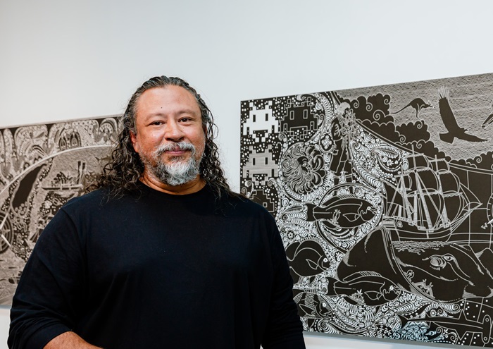
Above:
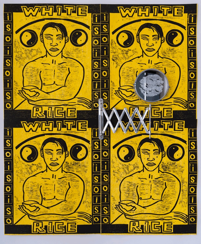
Richard Harding, Rainbow Woodcut: ISO, 1996/2022, woodcut relief print, 60 x 50 cm, edition 24. Printed at APW inc. Access Studio. Photography: Pia Johnson
Below:
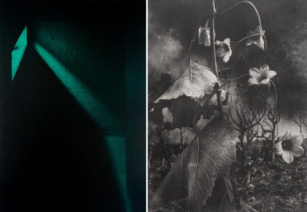
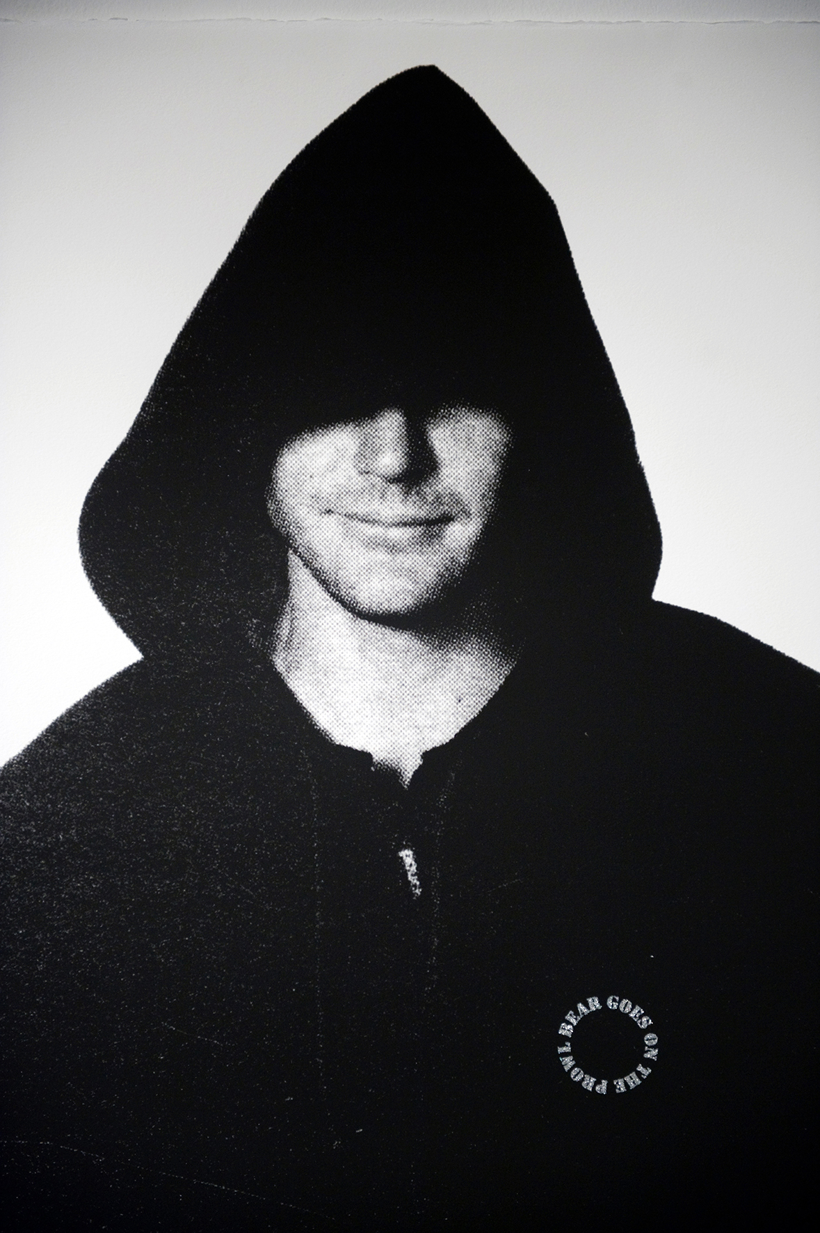
Richard Harding, Wardrobe Act1: Bear, 2013/2024, photographic screenprint [detail], 105 x 75 cm, edition 10, unique state. Printed at RMIT University Print Studio and Miller Studio. Photography: Screaming Pixel Photography
Richard Harding, Pinkwashing: celebration, 2018/2019, photographic screenprint, edition 5. Printed at RMIT University Print Studio. Photography: Screaming Pixel Photography
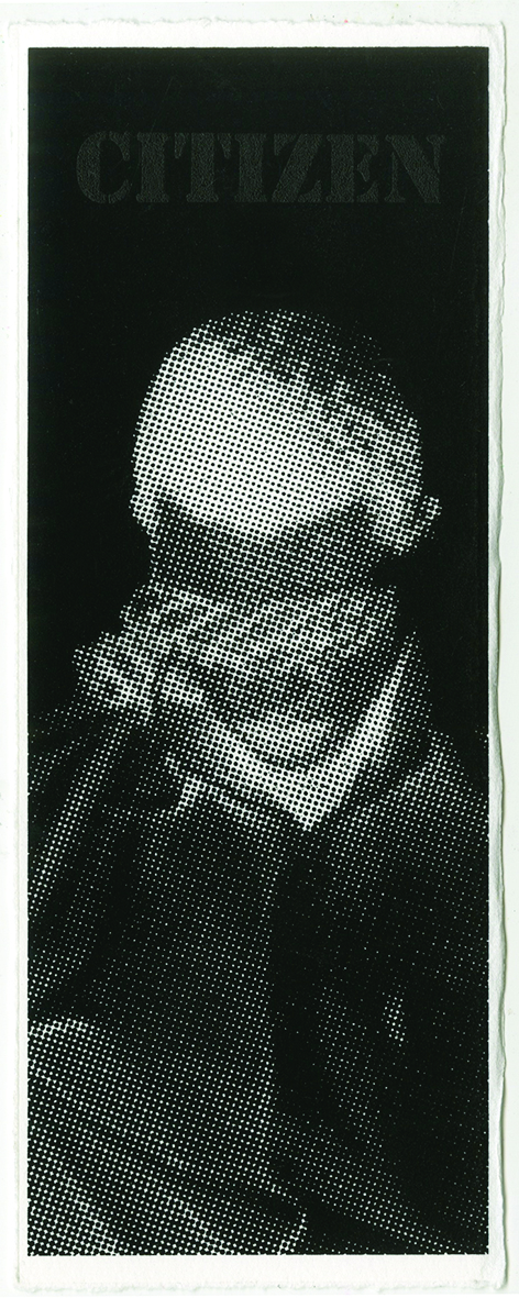
Richard Harding, Boy Citizen, 2017-2018-2024, photographic screenprint, 18.5 x 7.5 cm, multiple with artist logo – reprinted for each exhibition. Printed at RMIT University Print Studio. Photography: Screaming Pixel Photography
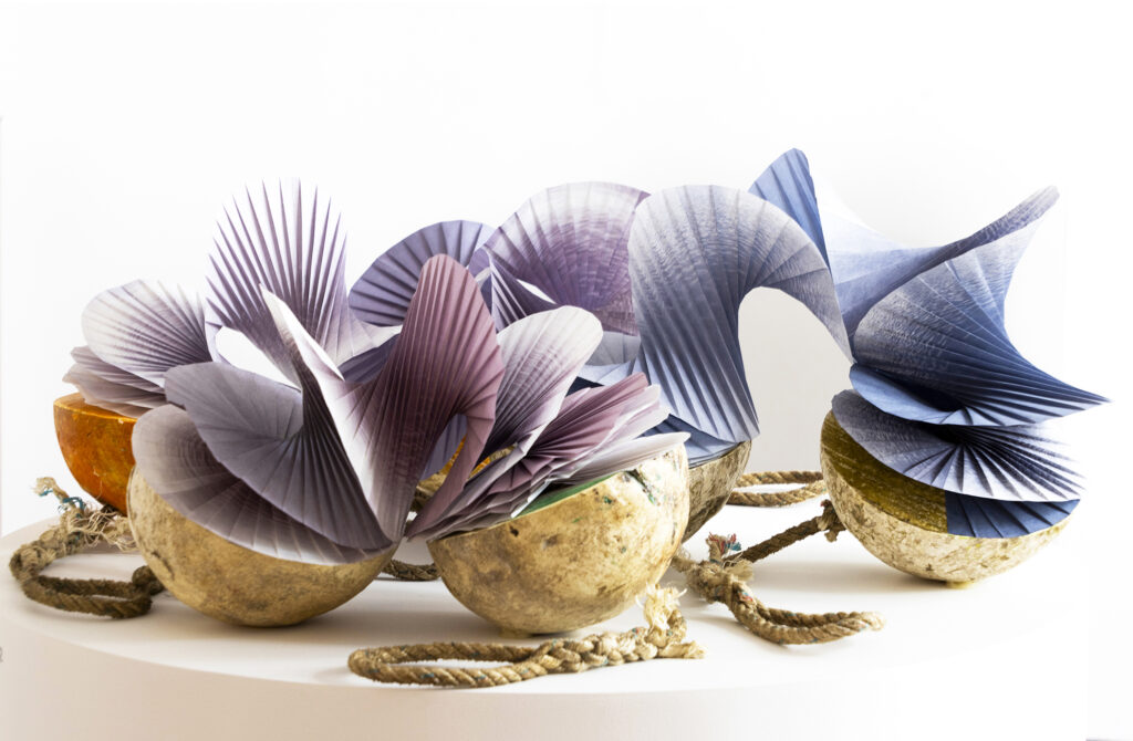
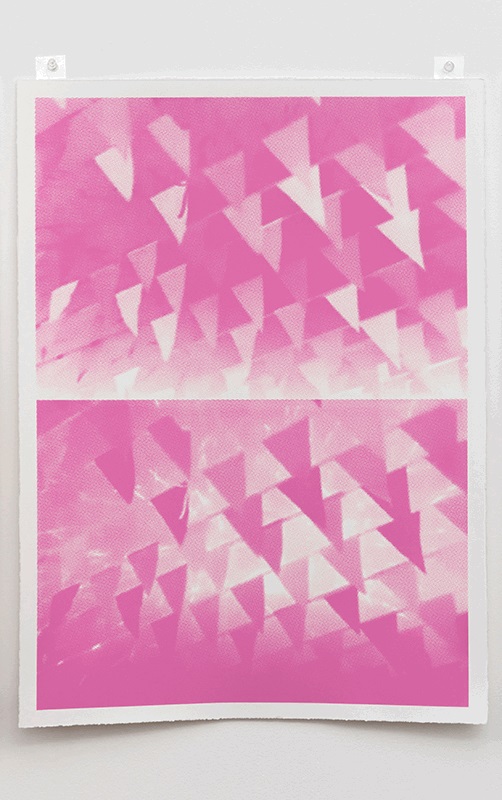
Richard Harding, Boondoggle, 2023, photographic screenprint, edition 5, printed at and by Troppo Print Studio. Photgraphy: Curry/Nilsen Photography
All images courtesy of the artist
Q: What were some of the foundation ideas for this exhibition project?
A: The Moving in Circles exhibition was first proposed in mid 2023 by then Megalo Print Studio Director, Stephen Payne. We discussed various exhibition options, from creating a new print project, curatorial project or an archival survey that incorporated past printworks. After several emails and a couple of phone calls we landed on a combination of these modes of exhibition production. This offered the opportunity to present printworks predominately shown only once or twice in other cities to be reconfigured within the Megalo Print Studio gallery space.
Ranging from relief prints to photographic screenprints, the artworks highlight ongoing topics of concern from nuclear disarmament to human rights focusing on LGBTQIA+ stances—local and global. Moving in Circles leans into the inherent qualities of print: sameness, difference and repetition. These performative actions which operate when printing are conceptually activated in the final artworks. The exhibition aims to pose visual political questions for viewers to reflect on.
Q: How did the artwork selection take place?
A: As the subtitle of the exhibition suggest all the artworks have been sourced from my studio archive with some prints re-printed and one produced this year. During the re-examination of my archive, I came to realise various themes and philosophical concerns addressed within my practice had cycled or been repeated in different modes over the course of decades. From the processes of coming out to celebrations washed pink, these multifaceted and complex practises have been revisited due to ongoing homophobia, transphobia and xenophobia in their many forms. With this in mind, the Rainbow Woodcut series from 1996 was the first set of prints from the back catalogue of artworks to be selected. These printworks heralded my move from polite subversion to amplified visual declarations for equal rights. These colourful expressionist prints provided a conceptual anchor for the exhibition with references to their time of production using song lyrics or personal advert acronyms as background text. This triggered the selection of the colourful Boondoggle series from 2023 which has been matched with monochromatic sets of prints like Silence with Boy Citizen (2017), Pinkwashing (2018/19-24) and Wardrobe Act 1 (2013) unique state screenprints.
Q: How does the exhibition manifest – what do visitors experience?
A: The installation of an exhibition is the finale of the creative process for me. Using a combination of colour and grey scale palettes the exhibition has been installed to entice and intrigue viewers. The eclectic mix of mediums and styles of print production have been selected to give viewers a layered experience of pleasure and meaning. There is a campness to the exhibition that is activated by the viewer as they move through the space. Notions of ‘colour and movement’ are signalled by primary, secondary and even tertiary hues partnered with the materiality of glitter and collaged one liners from newspaper headlines. These elements hold political significance of celebration and humour as resistance.
Q: What are some of the key works and what subject matter do they deal with?
A: Moving in Circles presents six sets of printworks which talk to various concerns of the day or time they were created in. Due to this, my practice has a diaristic strain that mixes the personal with the political. At times this has been considered too much by some and not enough by others. Thus, the printworks are a personal commentary that is not aligned to any group or organisation. All the artworks come from exhibitions or projects that had a particular premise or objective.
Rainbow woodcuts (1996) was my response to the rise of the rainbow flag in Australian and issues within the then LGBT community. Each colour offers an allegorical backdrop to represent an aspect of gay life from the mid-1990s. Influenced by expressionist modes of making these distinctive male depictions operate as snapshots of narratives from lived experiences.
Pinkwashing (2018) was derived from an SBS News broadcast from January that year. The appropriated images mingle the opening ceremony of the Veduchi ski resort in Chechnya with scenes of targeted attacks on gay, lesbian and trans people that were occurring at the same time. Acts of ‘pinkwashing’ like this continue to play out across the globe as well as locally with politicians attending pride marches while staying silent on atrocities inflicted on the queer community. This series finishes with a single image reprise from 2024.
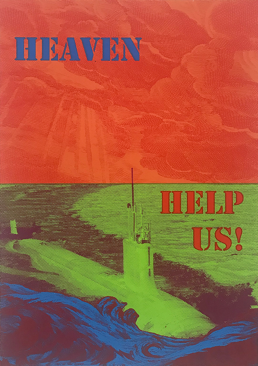
Boondoggle Phase 3 (2023) was co-created with TROPPO Print Studio and is the third instalment of the series referencing printmaking history and contemporary working methods, this collaged image is a cautionary comment on the AUKUS defence pact. This final version employs collaged news headlines for nuanced emphasis.
Past and Present (2017) juxtaposes historic cinematic images with contemporary news headlines to acknowledge the ongoing struggle of same-sex attracted people for equality. Based on images from a found book titled Idol Worship 2003 by Michael Ferguson, the series presents current debates on equality employing desire and humour.
Silence with Boy Citizen (2017) pairs images sourced from online news items to comment on the oppression and abuse—at times leading to death—of LGBTIQA+ people from various parts of the world. According to American theorist Susan Sontag in, Regarding the Pain of Others, “something becomes real – to those who are elsewhere, following it as ‘news’ – by being photographed” (2004, p19). It is this becoming real from afar that this pairing attempts to interrogate.
Wardrobe Act 1 (2013) talks to how clothes play a role in identity performance. The hoodie for example, can be ‘protector’ or ‘deceptor’ because as a generic garment it offers the privilege of anonymity or can be stylish couture depending on the designer and wearer’s intent. Presented as a simulated lineup the repetition of sameness is undermined by differences in printing production and the addition of an individual logo of text flocked with glitter.
Q: What is it about the printmaking experience that you most appreciate?
A: The process of making a print—in any of its mediums—offer a practitioner at specific points of making time to reflect, interpret and adjust. From preparatory works to proofing and even editioning there is an ongoing amazement as the image is revealed in its new guise. Considering printmaking is based in reproduction there is a continual essence of uniqueness that is authenticated by the individual practitioner’s manner of production.
—
Richard Harding’s Moving in Circles is at Megalo Print Studio, 21 Wentworth Ave, Kingston, 13 July to 24 August. Open Tuesday-Saturday 9.30am-5.00pm. Opening event 13 July, 2-4pm. www.megalo.org/
—
Join the PCA and become a member. You’ll get the fine-art quarterly print magazine IMPRINT, free promotion of your exhibitions, discounts on art materials and a range of other exclusive benefits.
